- Packages I will use to read in and plot the data
- Read the data in from part 1
Interactive graph
- Start with the data
- Group_by country so there will be a “river” for each country
- Use e_charts to create an e_charts object with Year on the x axis
- Use e_river to build “rivers” that contain Wage Gaps by country. The depth of each river represents wage gap percentage for each country
- Use e_tooltip to add a tooltip that will display based on the axis values
- Use e_title to add a title, subtitle, and link to subtitle
- Use e_theme to change the theme to roma
country_wageGap   %>%
  group_by(country)  %>%
  e_charts(x = Year)   %>%
  e_river(serie = WageGap, legend=FALSE)  %>%
  e_tooltip(trigger = "axis")  %>%
  e_title(text = "Annual Wage Gap, by country",
          subtext = "(in percentages). Source: Our World in Data",
          sublink = "https://ourworldindata.org/economic-inequality-by-gender",
          left = "center")  %>%
  e_theme("roma")
Static graph
- Start with the data
- Use ggplot to create a new ggplot object. Use aes to indicate that Year will be mapped to the x axis; wage gaps will be mapped to the y axis; Country will be the fill variable
- geom_area will display WageGap
- scale_fill_discrete_divergingx is a function in the colorspace package. It sets the color palette to roma and selects a maximum of 12 colors for the different countries
- theme_classic sets the theme
- theme(legend.position = “bottom”) puts the legend at the bottom of the plot
- labs sets the y axis label, fill = NULL indicates that the fill variable will not have the labelled Country
country_wageGap   %>%
  ggplot(aes(x = Year, y = WageGap,
             fill = country)) +
  geom_area() +
  colorspace::scale_fill_discrete_divergingx(palette = "roma", nmax =11) +
  theme_classic() +
  theme(legend.position = "bottom") +
  labs( y = "in billions of tonnes",
       fill = NULL)
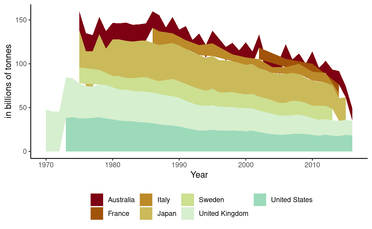
These plots show a decrease in wage gaps since 1970. Wage gaps have continued to decrease with occasional spikes.